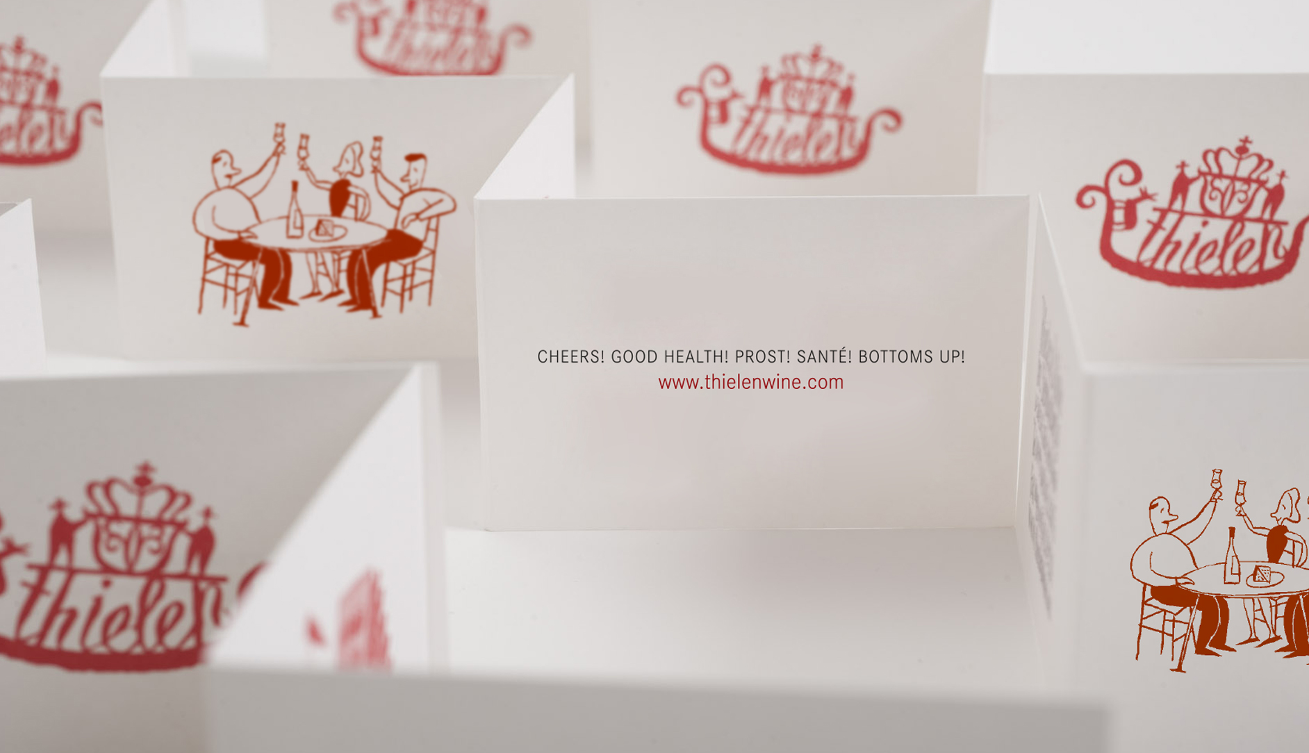
Corks a-poppin’
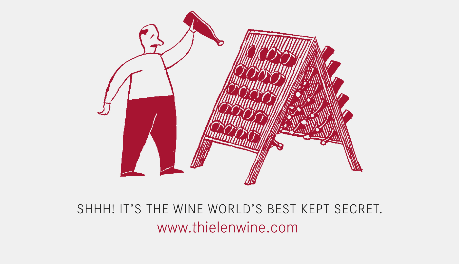
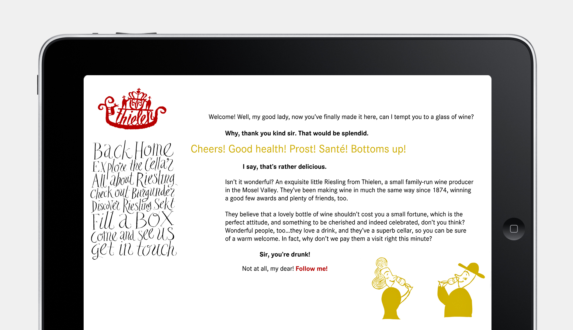
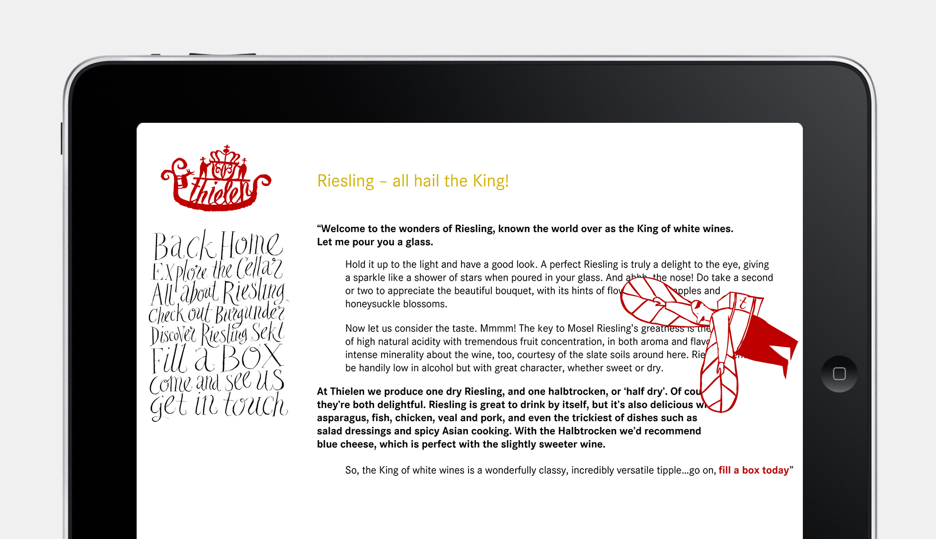
We do enjoy a tipple over here at Serious Oomph, so we were more than happy to help this family-run German winemaker launch their wines over here in the UK. Focusing on the family dynamic, we created a quirky and engaging tone of voice to bring the family members vividly to life. The website finds them escorting visitors on a tour of the wine cellar, holding forth about wine, history and philosophy, like a cross between Phileas Fogg and Keith Floyd in his Sancerre-sloshing heyday.
It works a treat, but there’s a secret behind the success. The tangible tipsiness of the tone probably reflects the fact that we were paid in wine; many crates of it, and lots in advance, strictly for inspiration’s sake. The rebrand was a triumphant success, launching Thielen’s fabulous wines in the UK, creating a huge boost in sales and bagging a handful of awards – so the corks were popping long after the project was delivered. Hic, hic, hooray!
Client Thielen Wine
Skills Brand language development, Concept, Packaging, Print, Web copy
Working with Together Design
Accolades Winner, Benchmarks Strategic Branding Award. Winner, Communication Arts Award. Finalist, London International Advertising Awards. D&AD In-book Awards 2005 (x 3).
You might also like: